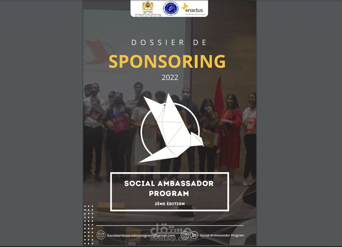
Page De Garde Dossier De Sponsoring

Okay, picture this: I’m at a networking event, armed with a stack of beautifully designed sponsorship proposals. I hand one over with a flourish, feeling all professional. The guy takes it, glances at the cover… and immediately starts talking about the open bar. Sigh. The cover, folks, the page de garde, should be doing all the talking (metaphorically, of course, unless you’ve managed to invent a talking document).
So, what’s the deal with this oh-so-important first impression? Let's dive into the world of the page de garde dossier de sponsoring. Think of it as the carefully chosen outfit for your proposal – it needs to catch the eye and hint at the amazingness within.
Why Bother with a Page de Garde Anyway?
Seriously, why? Because attention spans are shorter than ever! You're competing with emails, cat videos, and the siren call of… well, everything. A well-designed page de garde is your chance to make a strong first impression, to say, "Hey! I'm worth your time!"
Must Read
It's not just about aesthetics, although that's definitely part of it. It's about professionalism, about showing that you care about the details, and that you've put thought and effort into your proposal. (And let’s be honest, showing you're not a complete amateur!)
Think of it like online dating: No one swipes right on a blurry, badly lit photo, right? Same principle applies here. You want that swipe right… or in this case, that "Tell me more!"

Key Ingredients for a Killer Page de Garde
Alright, so how do we make this magical cover page a reality? Here's the recipe:
- Your Logo (and Name!): Obvious, but essential. Make it prominent, but not overwhelming.
- Project/Event Title: Clear, concise, and engaging. Don't make them guess what you're pitching. (Think clever, not cryptic.)
- A Visually Appealing Image: This is where you can really grab attention. A high-quality photo or graphic that relates to your project is a must. Ditch the clip art!
- Your Contact Information: Duh! Make it easy for them to reach you. Phone number, email address, website – the works.
- Date (Optional): Helpful for tracking versions and ensuring everyone’s on the same page.
- Short, Intriguing Tagline (Optional): A catchy phrase that summarizes your project's mission or benefits. Use sparingly!
Important Note: Less is often more. Don't cram everything onto one page. White space is your friend!

Design Tips and Tricks
Now for the fun part! Here are a few design considerations to elevate your page de garde from "meh" to "magnifique":
- Color Palette: Choose colors that are consistent with your brand and that evoke the right emotions. (Avoid neon green unless that's your thing.)
- Typography: Select fonts that are easy to read and that complement your brand's personality. Don’t use comic sans. Ever.
- Layout: Create a visually balanced and uncluttered layout. Use a grid system to ensure consistency.
- Consider Your Audience: Tailor the design to appeal to your target sponsors. What are their values? What kind of aesthetic do they appreciate? (Do your research!)
Remember, your page de garde is a visual representation of your project. It should reflect its values, its personality, and its potential. So, put some thought into it! Invest in good design (or at least learn the basics). Your sponsorship proposal – and your future funding – will thank you.
So next time you're crafting a sponsorship proposal, don't neglect the page de garde. It's your secret weapon for making a killer first impression and getting your foot in the door. Good luck, and happy sponsoring!