Page De Garde Bien Presenter Rapport De Satge
Okay, picture this: I'm in a panic, 2 AM, due date looming. My internship report is basically done (or so I thought… naive, right?), but then I stare at the blinking cursor, facing the dreaded page de garde. Suddenly, everything feels wrong. Like showing up to a black-tie event in pajamas. You know that feeling?
That’s when it hit me: the page de garde isn’t just some formality; it's your report's first impression. And first impressions, my friends, matter. Especially to that professor who looks like he hasn't slept since the invention of the printing press.
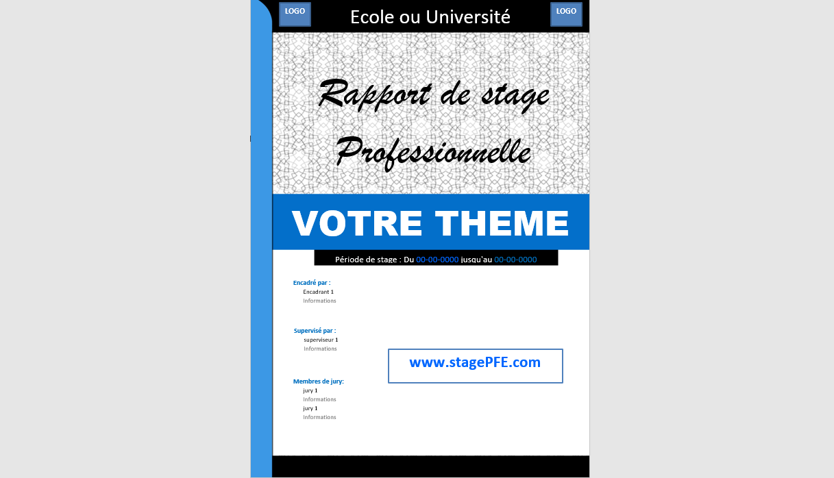
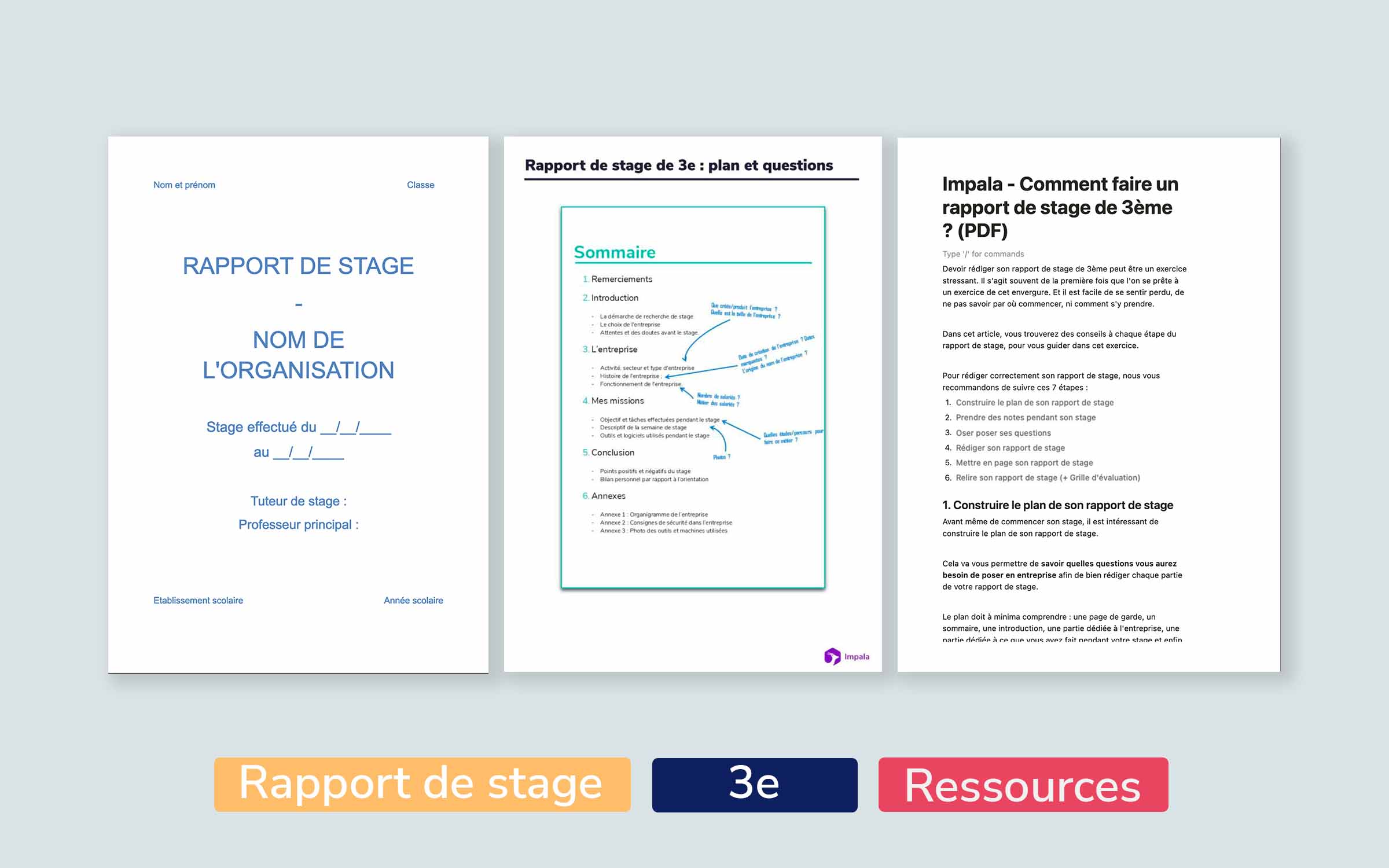
So, what is this mysterious "page de garde," and how do you make it… well, not suck? It's basically the title page of your report, but it needs to convey professionalism and clarity. Think of it as the cover of a book. Would you pick up a book with a smudged title and Comic Sans font? Probably not. Your evaluator probably wouldn't give your report the attention it deserves either.
Must Read
Essential Elements of a Stellar Page de Garde
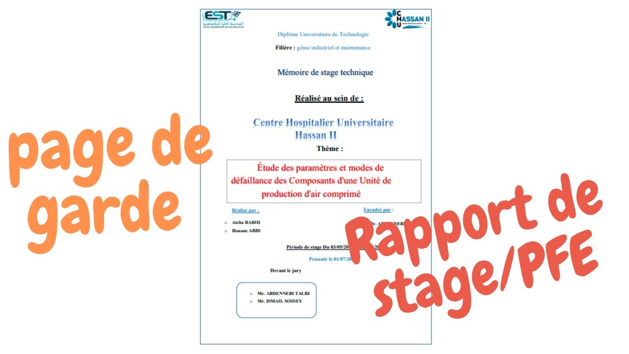
Alright, let's break it down. What absolutely needs to be on that page? Think of it as your "mission-critical" information:
- Titre du Rapport: Obvious, right? But make it clear and concise. No rambling essays here. And for the love of all that is holy, check your spelling.
- Nom et Prénom: Your name, as it appears on your birth certificate (or driver’s license, at least).
- Nom de l'Entreprise / Organisation: Where you slaved away (kidding… mostly!). Double-check the spelling of their name. Trust me, they notice.
- Nom et Prénom du Tuteur de Stage: Your supervisor’s name. Spell it right! Seriously. This is where you impress them...or not.
- Date du Stage: The period of your internship (e.g., "Juin - Août 2023").
- Nom de l'Établissement d'Enseignement: Your school.
- Département/Filière: Your department or program. "Informatique"? "Marketing"? Make it clear.
- Année Académique: The academic year. For example, "Année Académique 2022-2023".
See? Not rocket science. But attention to detail is key.
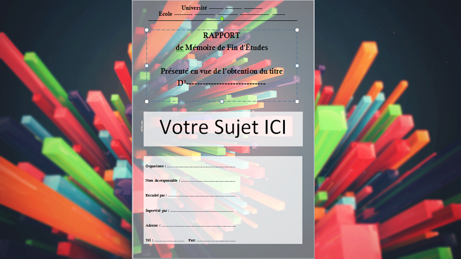
Aesthetics Matter (a Little)
Now, for the design. You don't need to be Picasso, but a little effort goes a long way. Here are some tips:
- Font: Stick to classic, professional fonts like Times New Roman, Arial, or Calibri. No Comic Sans! (I had to say it again).
- Font Size: Use consistent font sizes. The title should be larger, of course.
- Layout: A balanced layout is crucial. Don't cram everything into one corner. Think about visual hierarchy. Where do you want the reader's eye to go first?
- Logo: If your institution or the company you interned for has a logo, include it (if you're allowed to).
- Couleur: Keep it simple. Too many colors can be distracting. Think professional, not psychedelic.
Think minimalist chic, not kindergarten art project. You want to convey competence, not a passion for glitter.
Final Touches and Double-Checking
Okay, almost there! Before you hit "print" (or upload that PDF), do a final sweep:
- Proofread: Seriously. Get someone else to read it too. Fresh eyes catch errors you might miss.
- Consistency: Are the fonts and sizes consistent throughout the page?
- Alignment: Are elements properly aligned? Sloppy alignment screams "rushed!"
Remember, your page de garde is your opening statement. Make it count! Good luck, and may your internship reports be forever well-received!